This is my initial idea, I refer this idea from a book, it looks like a train and the destination means 100% skills and there have each station means different level skills. I though it is interesting. However, it is not relevant with my website subject, so I ban this idea.
Reference from book call toy design.
This is my second idea draft. In the beginning, I want to use different skills outline to show my skills, and use similar grey, because my menu element I use grey. Then, I though use similar gray is very hard to separate different skills espercially people who first time to use my website or they did not use or know lacquer or ceramic before. For them, it is hard to recognize what is that pattern means, so I change my idea. I used different color to represent different skills and add the words in the middle, even they don not understand the color they can see the vocabulary.
Add my graduation information. It can make people more clear to understand my education experience.
Create some circle, because I want to use these circles to represent my skills. I want to make a pie chart to show my skills.
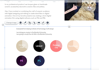
I used bigger circles to show my skills, and smaller circles to show software skills. because I want to show I have two types of skills, handmade skills and digital skills.
I used different color to show my differents skills, For example, grey means ceramic because this is ceramic color, lacquer used black to represent it is because black is a classic color in lacquer design, handmade skill used skin color is because I use my hand to make the product and I used pink to show polymer is because polymer clay is colorful, In order to suitable another skills color, I can not use mix color to show this skills, so I picked pink- my favourite color to show this skill. About the PR and PS I just used their logo color, it is easier to recognize.
Then, I edit some word here to show every circle meanings, software and skills using different word color because the software I follow their logo color.
I used similar color but deeper to separate the skills level. This is refer to pie chart means how much percentage I already know about this skill. I used PS to create two same size layer, and used pen tool to draw the extra part and cut it, so there have two layer but different color on a same pie chart.
I delete the black lines, because I thought there are not good-looking.
I used the same way to make these software pit charts. This is my infographic looks like.
I put this infographic to my about page, then, I found the word is different, it is not good,
I tried to find the same word in PS, but there are no this type of word here, so I kept to use the old one.
Even I tried to fix the word problem and change it to very similar size, but it still looks different.
In order to solve this problem, I delete the words on photoshop
I type the word is wix, so I can used the same word.
and add the new pie charts here.


No comments:
Post a Comment