Wednesday, 20 July 2016

Social media


Research for social media
https://www.youtube.com/channel/UCk7QnzUVXPFUHd1x-Jwkazw(19/07/16)
This is one of my favourite artist, she was a jewellery designer before, now she expanded her job and makes a range of products which handmade including book covers, decorative ornament and jewellery. She has her ownYoutube channel to impart people how to make the clay work and introduce her works as well, for this reason, I think social medias are very important to her to promote her works. 
http://www.mandarin-duck.com/(19/07/16)
Currently, she has seven social media platforms which are on her website and they are on the every pages the situate above the fold. I think is because she wants to maximise the chances for people click her social media icons and follow her.


https://uk.pinterest.com/mandarinduck/(20/07/16)
This is the first screen shot on 20/07/16, at that time she has 1.9 thousand followers. In her Pinterest introduce page, she have her website page, facebook and twitter but no youtube channel. She used this social media not only show her works but also share some great works from another people.
https://uk.pinterest.com/mandarinduck/(21/07/16)
On the 21/07/16, she already have 2 thousand followers which show that she is popular and the follower are growing in numbers. 

This is her google plus page, she has almost 3 millions view

https://www.flickr.com/photos/amandarinaduck/(21/07/16)
The social media in used very well, many different platforms are used, the social media links are interlinked. It is easy access one social media from another social media. Overall, the web presence for this designer is good and recognisable 
For my research, flickr is less popular social media in this artist work, because it is less following and less engagement overall. I think is because this social media is not the popular one and it do not have many users. She joined this social media in 2009, almost seven years, and she also upload 1359 photos in this social media, but she just have 25 following.

On the other hand, in her google plus account, her have almost 3 million views, it is quite different with flickr. I think when I need to use the social media to show my work, it is very important to choose the platform as well. The popular social media might be a good choice, because more people have chance to find your work, and they can share with their friends or family. It is good for work disseminate.


This is another clay tutor in Pinterst. She has 63000 followers in her Pinterest. In her introduce part, there have her personal website, facebook and twitter, but there do not have her youtube channel. 

http://www.beadsandbeading.com/blog/contact-me-2/#
This is her website, in her website she just upload some video to impart people how to use clay. In her contact page, there only have a from to provide people to sent the email to contact her, but there is no any social media button there, so, people can not contact her in social media through her homepage.

https://www.youtube.com/user/PolymerClayTutor
However, in her youtube channel, she have five social media.


This is her youtube channel, her channel is introduce many different tools and material in clay works. She did not introduce her works or teach people how to use clay to make some works. She only upload many different material can be used in clay work. It looks like a experimental tutorial. There has a big gap between her different video. In her youtube channel, the most popular one called 
and this video have 338174 views, and she upload this video in 2 years ago. However, the less views one just have 1003 views but I have to say she upload this video in one days ago. It is means that she is very popular and many people booked her youtube video.


This is her twitter page, there have 6254 followers, it is not much compare with Pinterest.

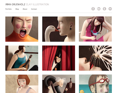
She is a clay artist call Irma Gruenholz, in her facebook page, she has 8373 followers.

This is her home page, she only have four social media to show her works.

In behance, she have 13381 followers, it is much more than her facebook follower, and this is my first time to see this social media, and I haven't seen another atrist use this social media without her.


This is her flickr page, she joined in 2009, until now already 7years, but she just have 848 follower, this is social media for her it is not very popular.

This is a fine-art artist call caia koopman. this is her facebook homepage, she have 21138 likes in her facebook.

This is her personal website, she use this website to sale her works as well, and I can see she just have three social media- facebook Instagram and youtube.
Her youtube just have three video and her update her video in three years ago, it means her has not used her youtube from three years ago.

In her insagran she have 14000 followers, and she undate her new picture in four days ago, I think this is her main social media and most popular one.


This is Chinese fine artist ai wei wei, in his insagran, he have 233000 followers, it is a hugu munber in artist filed.

However, he just have 5554 likes in his facebook.

This is another Japanese illustrator, her insagran has 6820 followers.

Her Facebook just have 557 followers
This situation is not just for this one artist, many artists have more followers in Instagram compare with Facebook.


According to my research, I decided to use insagram and pinterst in social media.

I upload my works and progress in social media and add my website address as well.


Reflective jorunal

Personal website design

My website address: http://irispun1113.wixsite.com/iris

This is my home page, I used my work picture to be my background, I want to show people what I can do and what I am doing, this picture here showing tools about lacquer. In the middle, I designed a white box and there have my website name and arrowhead there, this button can click to next page - about page. I did not design too much information or picture here is because I want to design my website simply and clearly,  and I thought visual feeling is better than much words,  people do not like read too much information. There have another reason to pick this picture is because this homepage picture is not just showing my work or my painting. I thought showing tools are more interesting, because some of them will interesting what is this picture means or they want to know what are you doing and click your next page. However, I want to change the arrowhead to white as well, but wix can not change this button, so I just used black.

This page is about page, I introduced myself in this page, when people click the arrowhead in home page and they can see this page. In this page I wrote my education experience and my abbreviated introduction. Also, I design my picture here. I used this picture is because it looks cute and interesting, I took this photography with my cat. I want to show I am an easy-going and nice people and I like animals especially cat.  On the other hand, according to my feedback from inah, I thought this photography just for now as a student, If I need to use this website to be my personal website in the future when I looking for a job, I should change my photography. I should pick a normal photography  and makes me looks more professional.

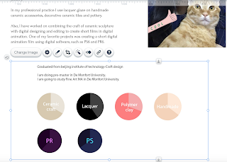
In addition, I design an infographic here to show my skills level. I have a short time-line to show my education on top of pie charts. In order to suit my website design, I used 2D pie chart to show my skills, because I do not have any 3D element in my website design. In my pie chart, I used two similar color to show my skills level. The deeper part means I already understand and the lighter part means there still have space I can improve myself, and I used different color to represent different skills, it will makes my pie charts more specific.


In these 2D and 3D part, I used the same style to design these parts, because I do not want to use too many complicated effect. I want to keep my website clean and easy to use and easy to find the information. For these reasons, I design a gallery here to show my works. When people want to know more detail information about my work, they can click the picture again, and it will shows them the detail about this work. According to my feedback from HA, I have a mistake about my titles, because the position about 2D and 3D title are not totally same position, they have a little bit different, so I need to use ruler to fix this problem.

This is my video part, the title style is same with 2D and 3D because both of them are my works, so they have same style, and I design the video window more bigger, because people can see my video clearly.

This is my contact page, I design my basic contact way and google map here and my social media as well. People can use this website to see my final work and my introduction, also, they can see my each progress of works through my social media.


This is my website feedback from HA
This is my website feedback from Inah


In this project I have done my website design, I think I did a well organize 


My feedback of presentation:


According to my feedback, I lack of structure of presentation, next time, I should do a power point or introduction to introduce the context and what I going to talk. It is more clear to audiences. In addition, I should use technical term to show my skill level as well. and I will continue to built my social media and webpage.

According to my feedback, I did some change for my website.
I add the social media icons on homepage, I choosed the gray one to corresponding the meun color.

and add the social media link.

I want to try to use the same icon with the contact part, but it is not good, it is easy to ignore it.

For this reason, I changed them to colorful icon, they look better.

Also, for the security problem, I delate my address on my website, just left social media and email address.


Tuesday, 19 July 2016

Infographic design

This is my initial idea, I refer this idea from a book, it looks like a train and the destination means 100% skills and there have each station means different level skills. I though it is interesting. However, it is not relevant with my website subject, so I ban this idea.

Reference from book call toy design.

This is my second idea draft. In the beginning, I want to use different skills outline to show my skills, and use similar grey, because my menu element I use grey. Then, I though use similar gray is very hard to separate different skills espercially people who first time to use my website or they did not use or know lacquer or ceramic before. For them, it is hard to recognize what is that pattern means, so I change my idea. I used different color to represent different skills and add the words in the middle, even they don not understand the color they can see the vocabulary.


Add my graduation information. It can make people more clear to understand my education experience.

Create some circle, because I want to use these circles to represent my skills. I want to make a pie chart to show my skills.

I used bigger circles to show my skills, and smaller circles to show software skills. because I want to show I have two types of skills, handmade skills and digital skills.

I used different color to show my differents skills, For example, grey means ceramic because this is ceramic color, lacquer used black to represent it is because black is a classic color in lacquer design, handmade skill used skin color is because I use my hand to make the product and I used pink to show polymer is because polymer clay is colorful, In order to suitable another skills color, I can not use mix color to show this skills, so I picked pink- my favourite color to show this skill. About the PR and PS I just used their logo color, it is easier to recognize.

Then, I edit some word here to show every circle meanings, software and skills using different word color because the software I follow their logo color.

I used similar color but deeper to separate the skills level. This is refer to pie chart means how much percentage I already know about this skill.  I used PS to create two same size layer, and used pen tool to draw the extra part and cut it, so there have two layer but different color on a same pie chart.

I delete the black lines, because I thought there are not good-looking.


I used the same way to make these software pit charts. This is my infographic looks like.

I put this infographic to my about page, then, I found the word is different, it is not good,

 I tried to find the same word in PS, but there are no this type of word here, so I kept to use the old one.

Even I tried to fix the word problem and change it to very similar size, but it still looks different.

In order to solve this problem, I delete the words on photoshop

I type the word is wix, so I can used the same word.

and add the new pie charts here.