Sushi box design
My idea
Logo 1
My idea is comes form Japanese national flag, because it is very to recognise. I haven't used the same colour as the flag,I changed to light colour,yellow-orange. Because light colour is easy to make people want to eat,and it looks very delicious and fresh.For the words,I use the Marker Felt,but I made some changes.I use eraser tool to make my logo word looks like handwriting, I think is more interest than just use the word.
My logo step
create a circle.
add our brand word.
change the size, and make it suitable
change different type of word, makes it more beautiful.
using brush to do some effect, make it looks like calligraphy
change the background colour to light colour, light colour makes people have more appetite.
change the word to black make it clearly.
make the size suitable.
This is my logo 1
Logo 2
sushi
sushi box
My idea is come form sushi with sushi box,but I try to make it more simply but looks still like sushi box.
create the black square, this is means simple black sushi box.
add the small size square and fix the size to be my sushi, and make the edge more smooth.
adjust their position
add the word in my simple 'sushi box'
My sushi logo 2
Sushi box
This is part is our group work:
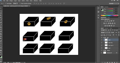
create many boxes and put the logo on the box
different size and different position logo on the boxes.
This is our final project.We discuss our project first,and than we distribute work.Florence and me in charge of logo, and Ha will design label design and put it on the box.Finally, we pick this one to be our final design,because we design top of this box is plastic, our customer can see what inside the box, we use black and white to design our box side, because we reference Chinese element Tai Ji, the black is ying, and the white is yang, they symmetry each other.


No comments:
Post a Comment